


.avif)
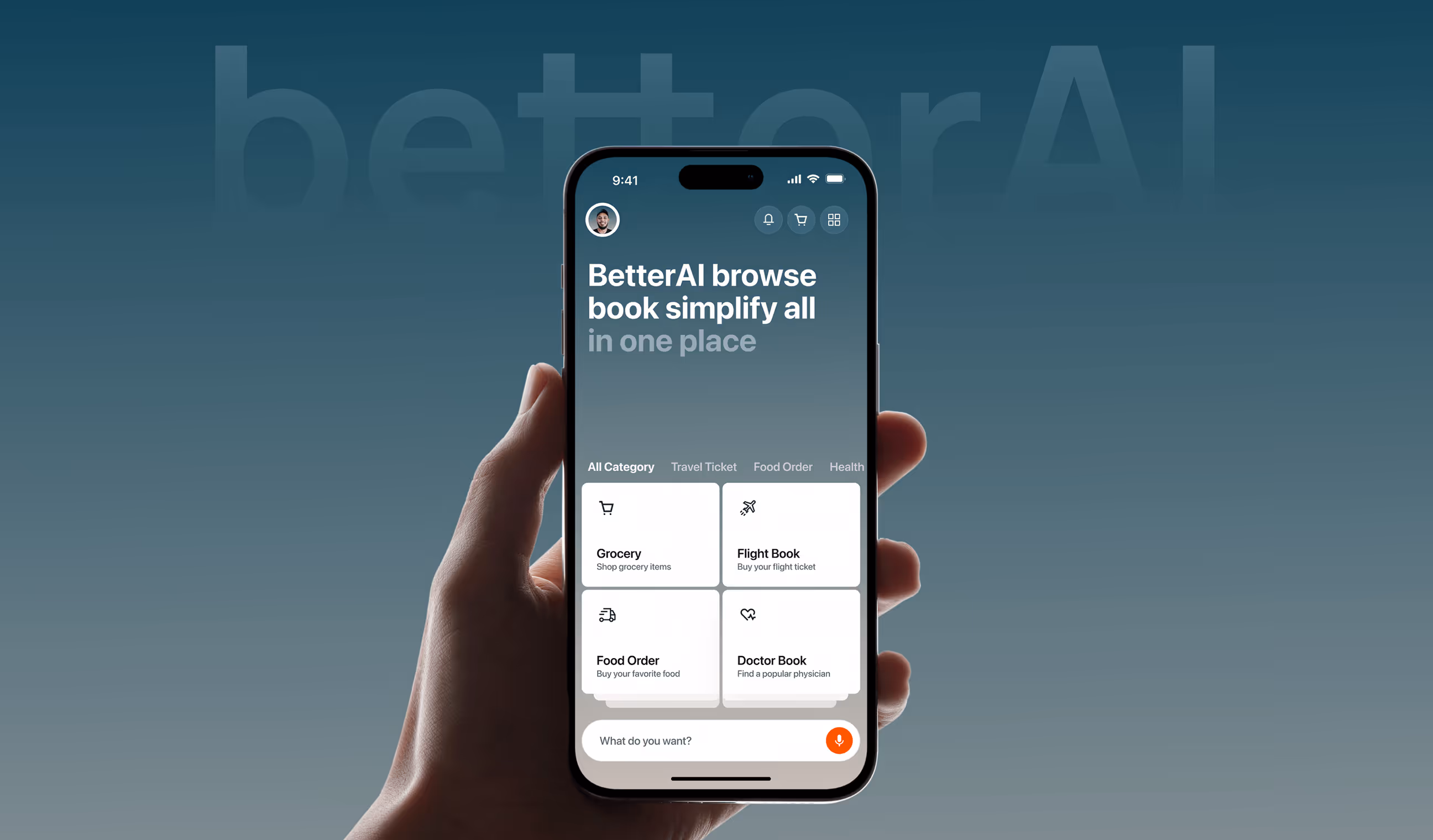
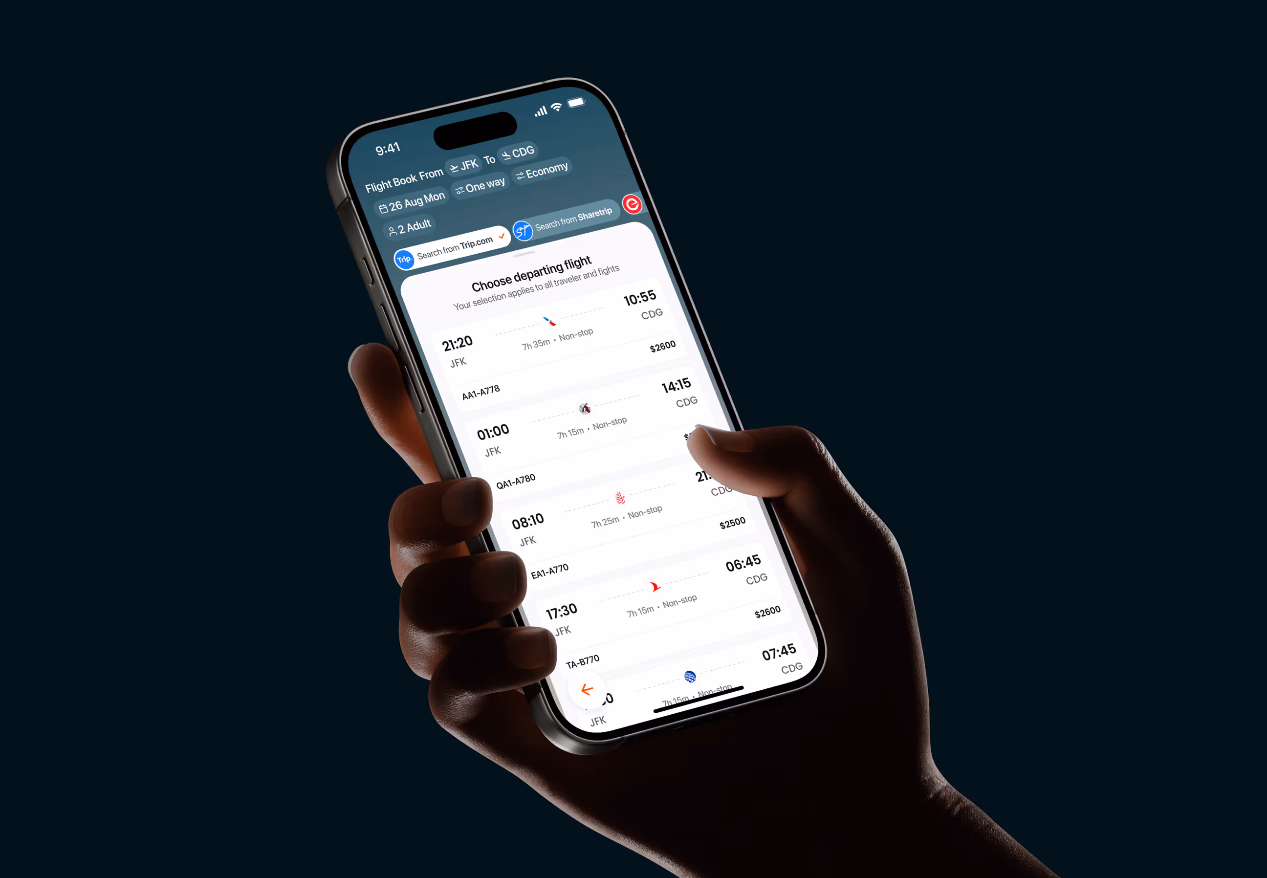
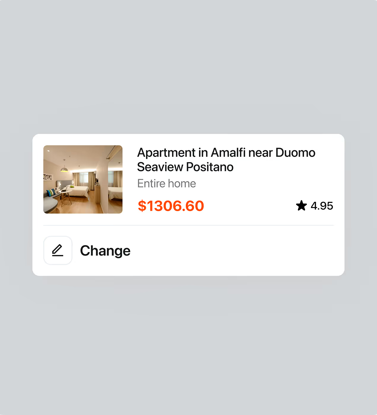
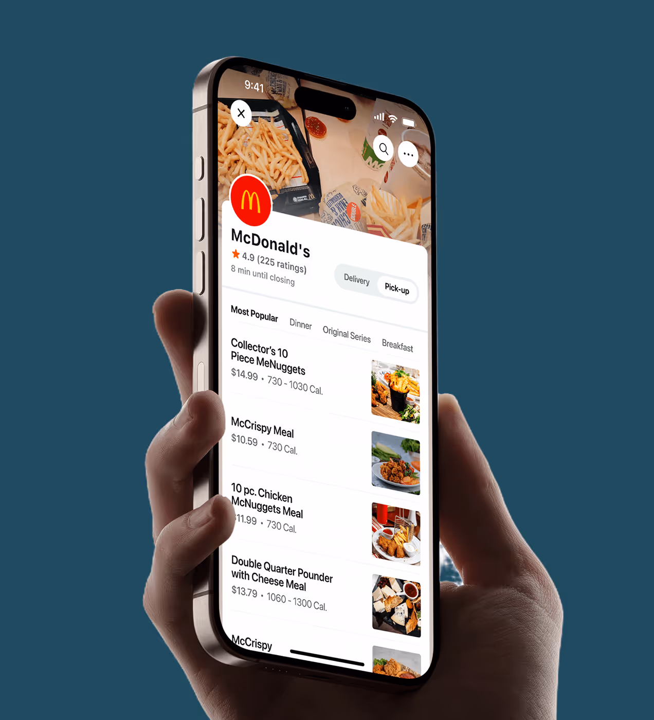
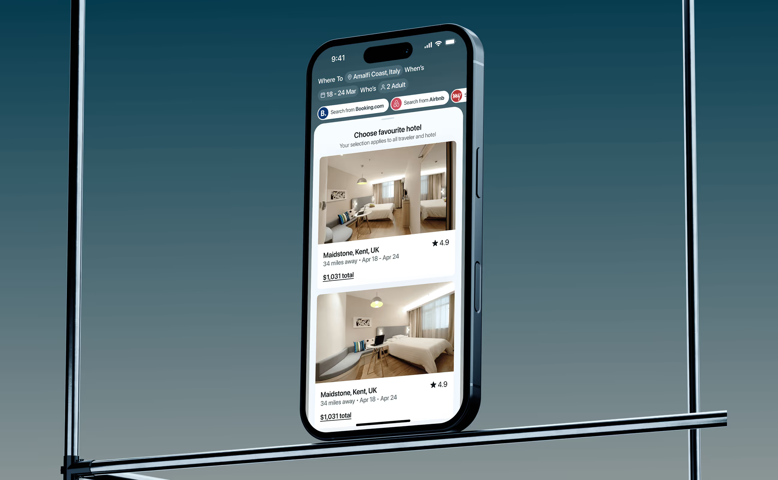
BetterAI is an all-in-one mobile platform that lets users manage everyday tasks like booking flights, ordering food, and scheduling doctor visits in one place. Built with AI at its core, it removes the friction of switching between multiple services.
The team came to us looking for a simple, trustworthy experience that could still handle complex tasks. We shaped a clear brand and a clean interface that feels modern, reliable, and built for long-term use.
.avif)
Users didn’t understand how BetterAI works.
BetterAI was built to simplify daily life through AI. But the initial version created hesitation instead of confidence. Users opened the app without a clear sense of direction, value, or trust, which caused drop-offs early in the journey.
- Unclear value proposition: Users couldn’t quickly understand what BetterAI does or how it helps them in real life.
- Overwhelming first impression: Too many options and actions upfront created confusion and mental fatigue.
- Weak visual trust signals: The interface lacked a strong visual identity, making the product feel unfinished and less credible.
- No guided onboarding: Users were left on their own with no clear path to complete their first meaningful task.
- Poor retention: Most users tried the app once and didn’t return, limiting long-term growth.
We redesigned BetterAI to help users act faster
To solve the unclear flow and early user drop-offs, we focused on simplifying decisions and helping users complete their first meaningful action faster. Every design choice was made to reduce cognitive load while increasing clarity and confidence.
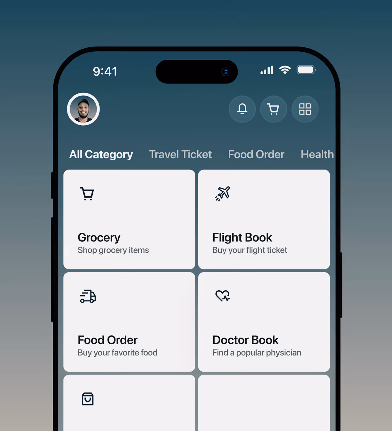
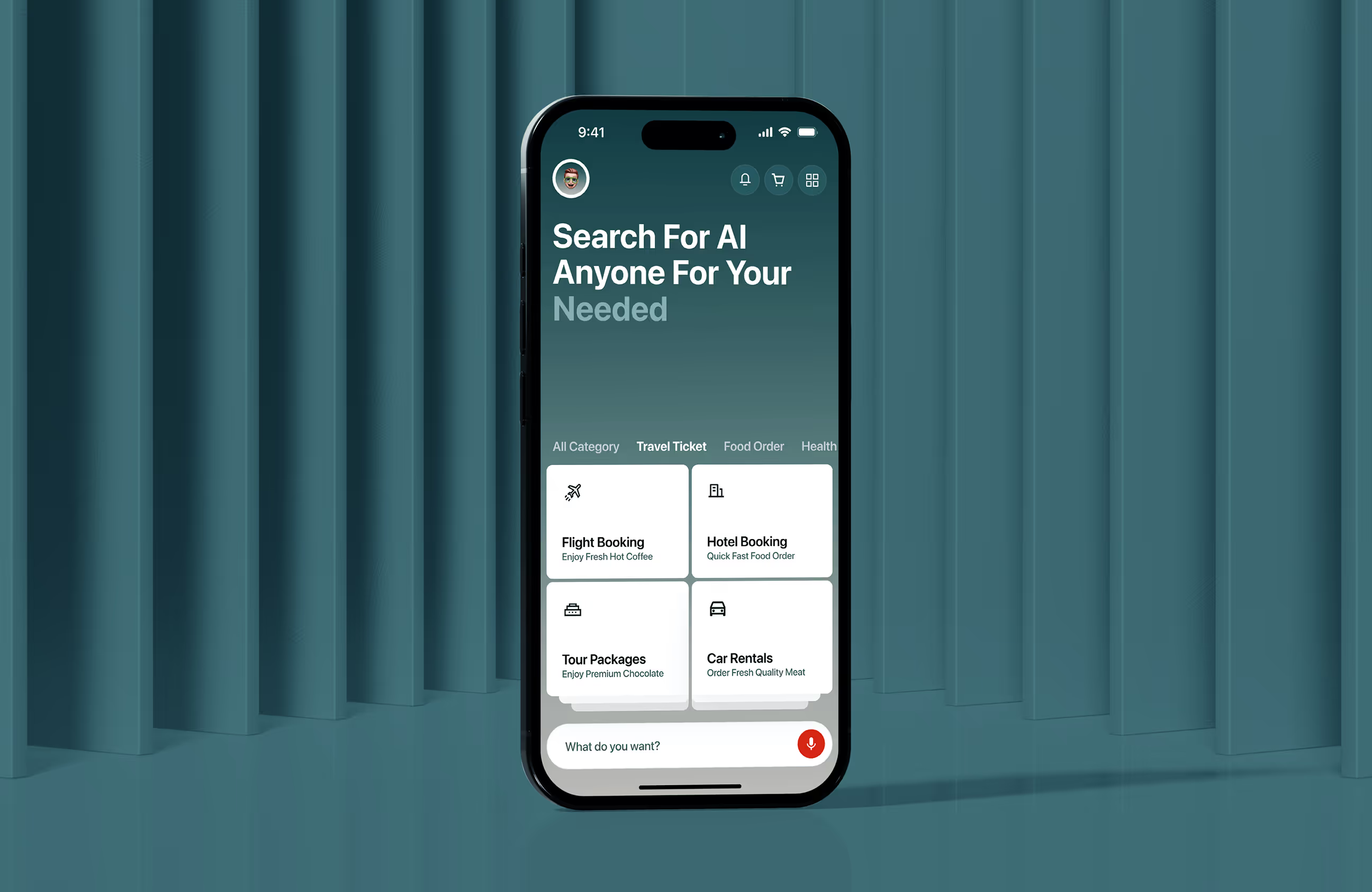
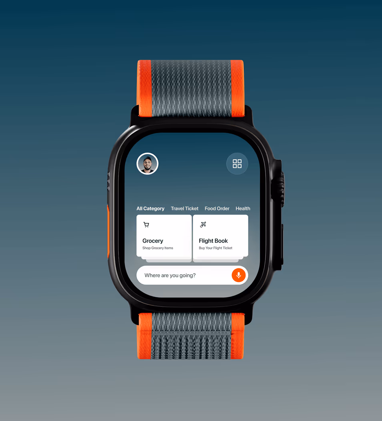
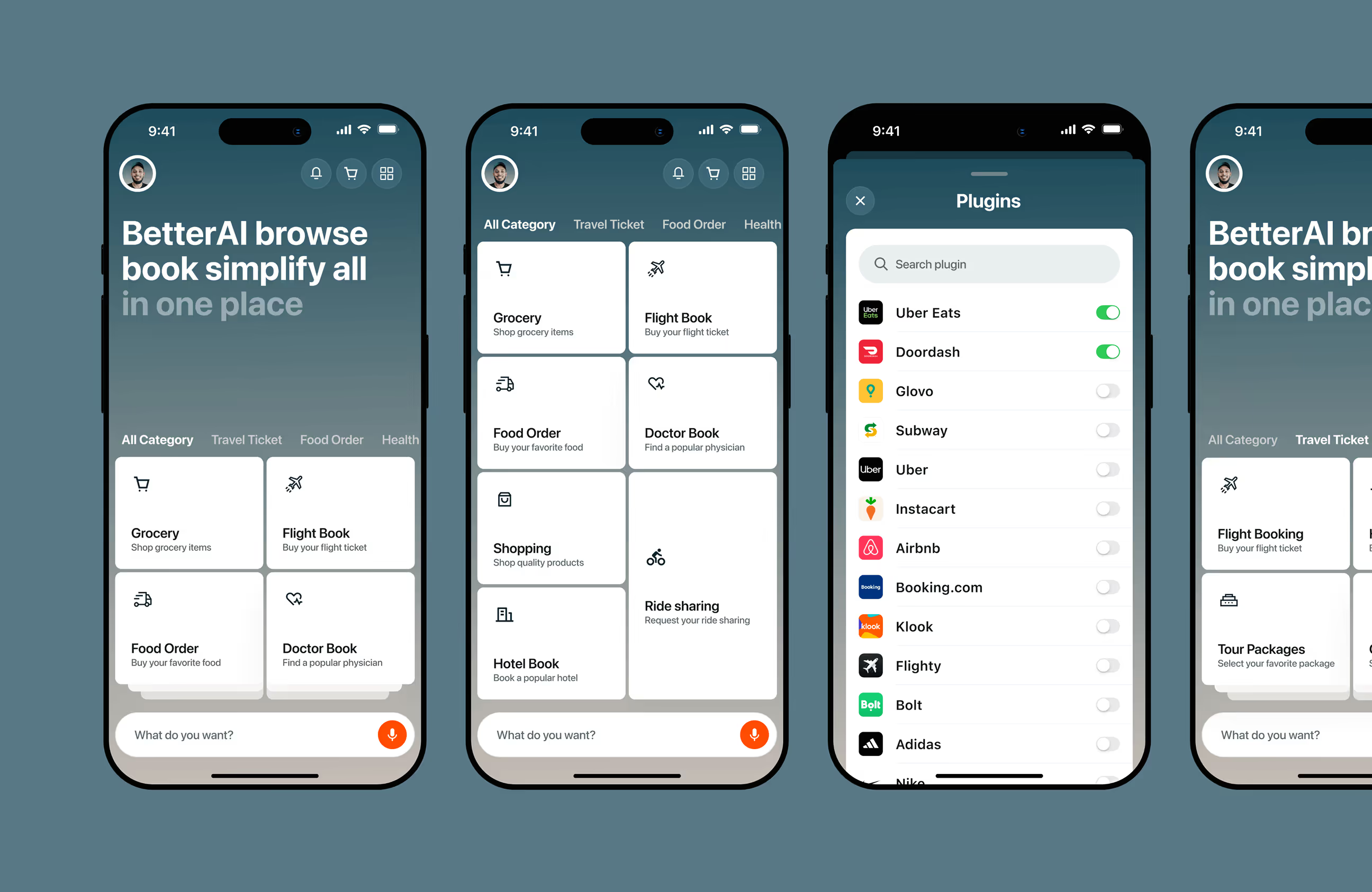
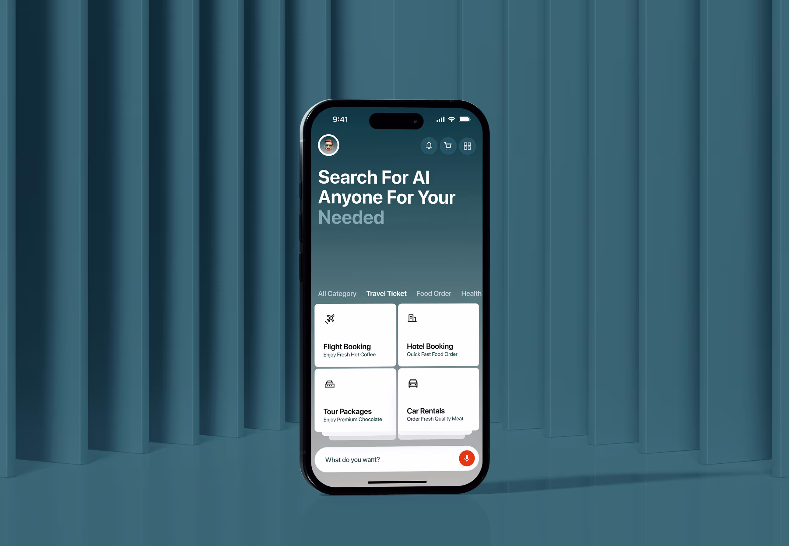
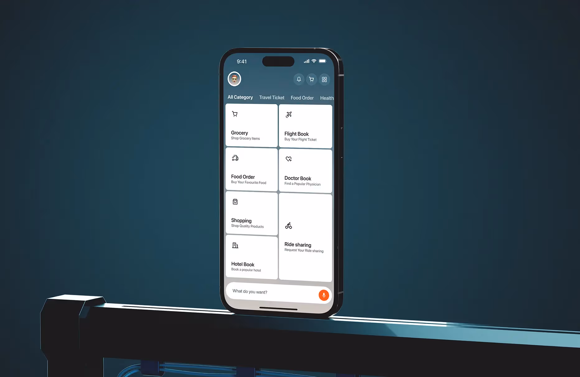
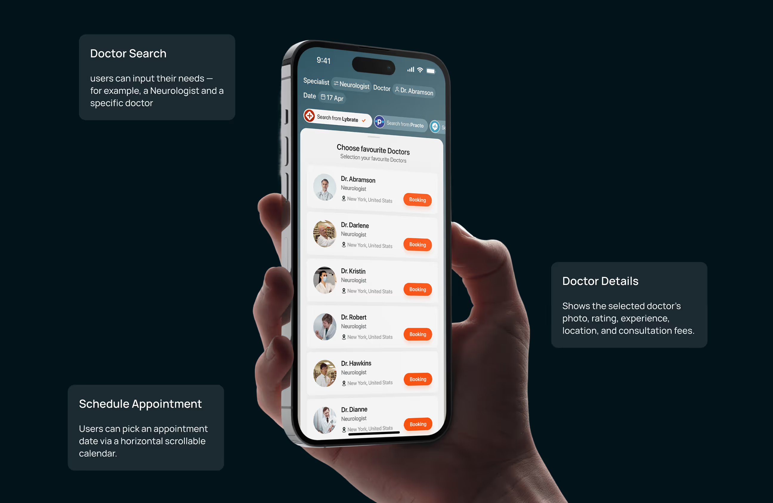
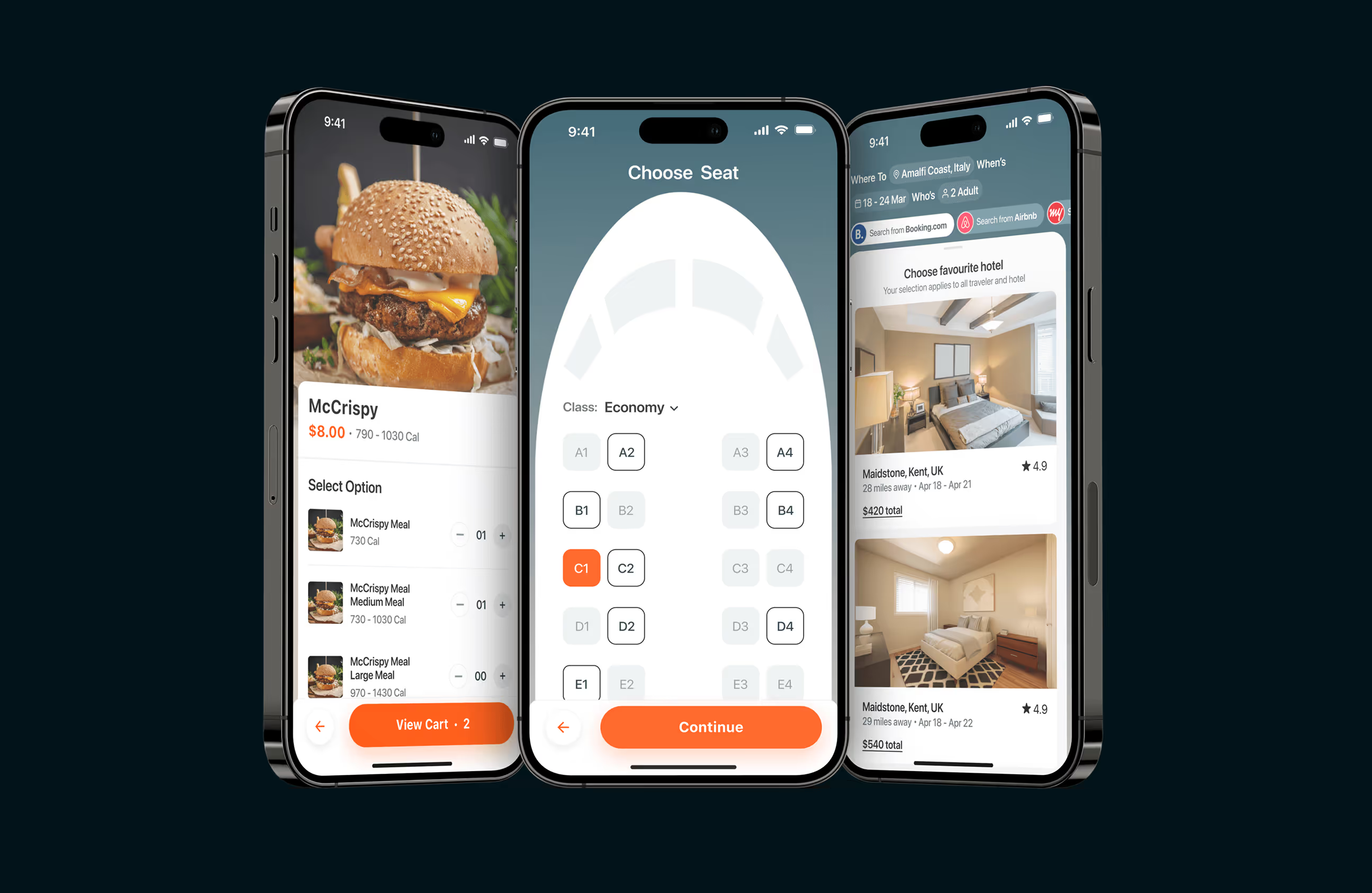
- One home screen: All key actions in one place for quick decisions.
- Built-In services: No app switching for rides, food, or bookings.
- Clean visual flow: Clear spacing and hierarchy guide the eye.
- Step-by-step tasks: Complex actions broken into simple steps.
- Trust first design: Calm visuals that feel polished and reliable.

UX design process for BetterAI
BetterAI followed a structured UX process that moves from understanding users to delivering a validated, launch-ready product.
To bring to light friction points, we talked to league operators, coaches, and athletes.
We mapped every use case across different roles and broke down flows to their essentials.
We built a clean, flexible design system that’s scalable across regions and device types.
We delivered dev-ready designs and supported beyond launch.
UX research & design artifacts
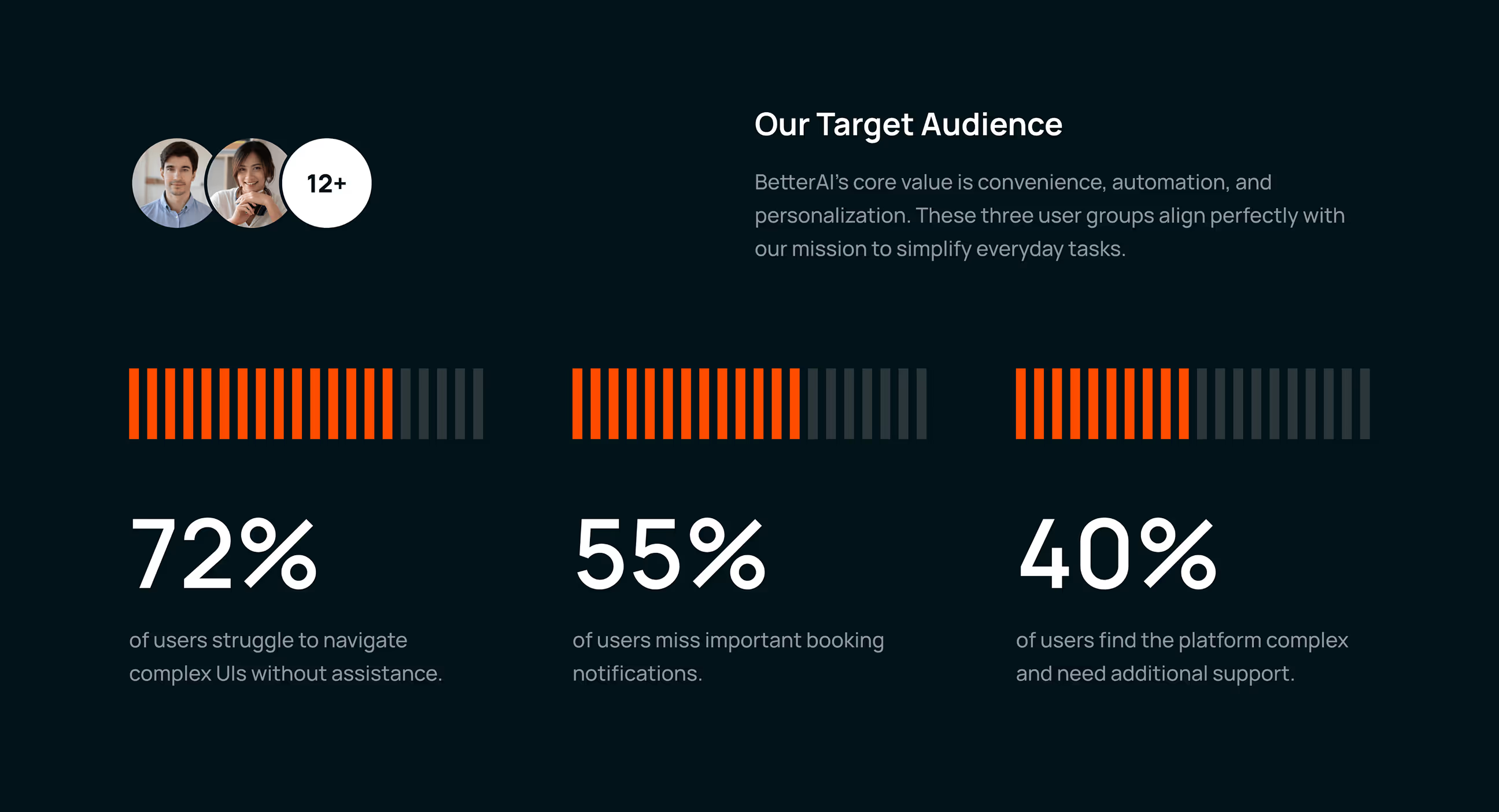
To design a clear and reliable experience, we focused on understanding how users interact with AI when managing everyday tasks. Our research helped shape a system that feels simple, helpful, and easy to trust.
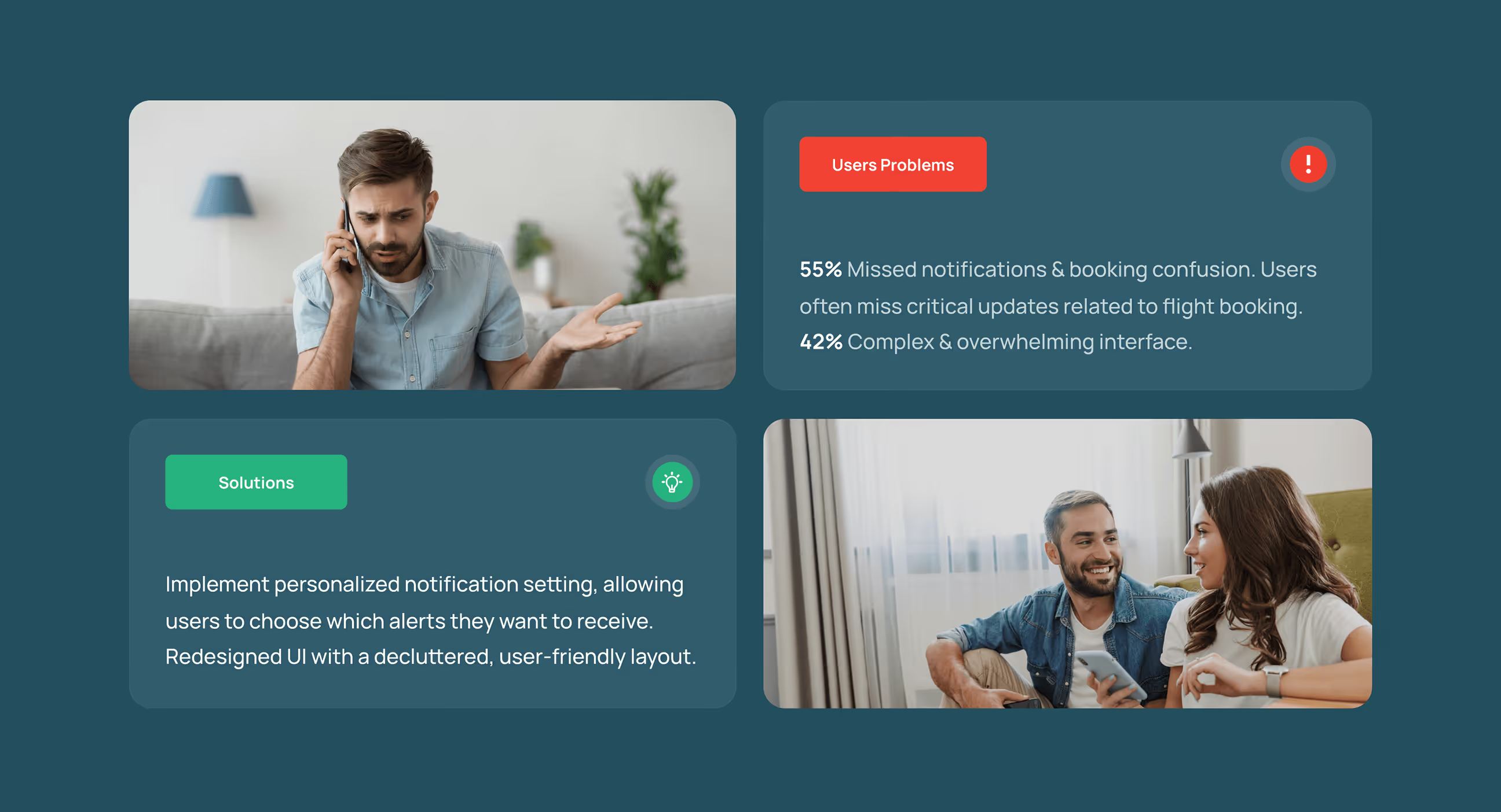
- Navigation friction: 72% of users struggled with complex layouts, causing hesitation and drop-offs during key actions.
- Missed system feedback: Important alerts and messages were often overlooked, delaying user actions and reducing confidence.
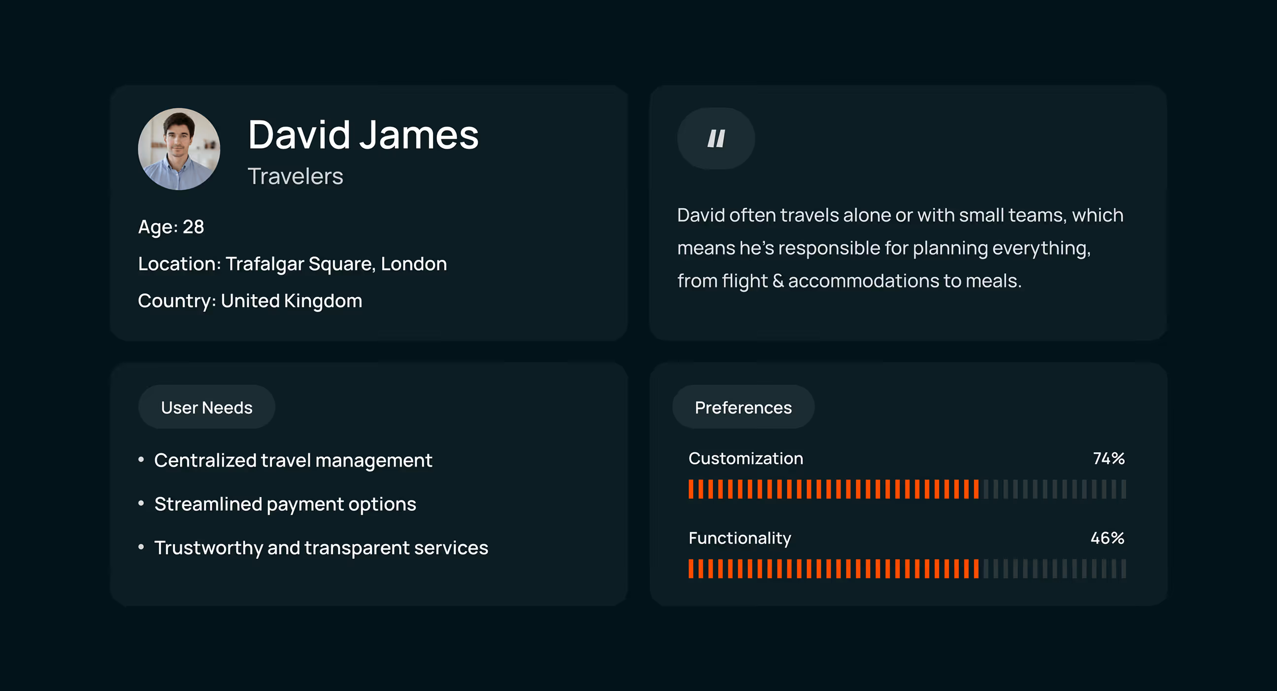
- User persona: Users like David value simplicity and control. They prefer guided flows and clear decisions without unnecessary options.
- Preference-based design: Users trust products more when they can personalize the experience, making customization a key design input.
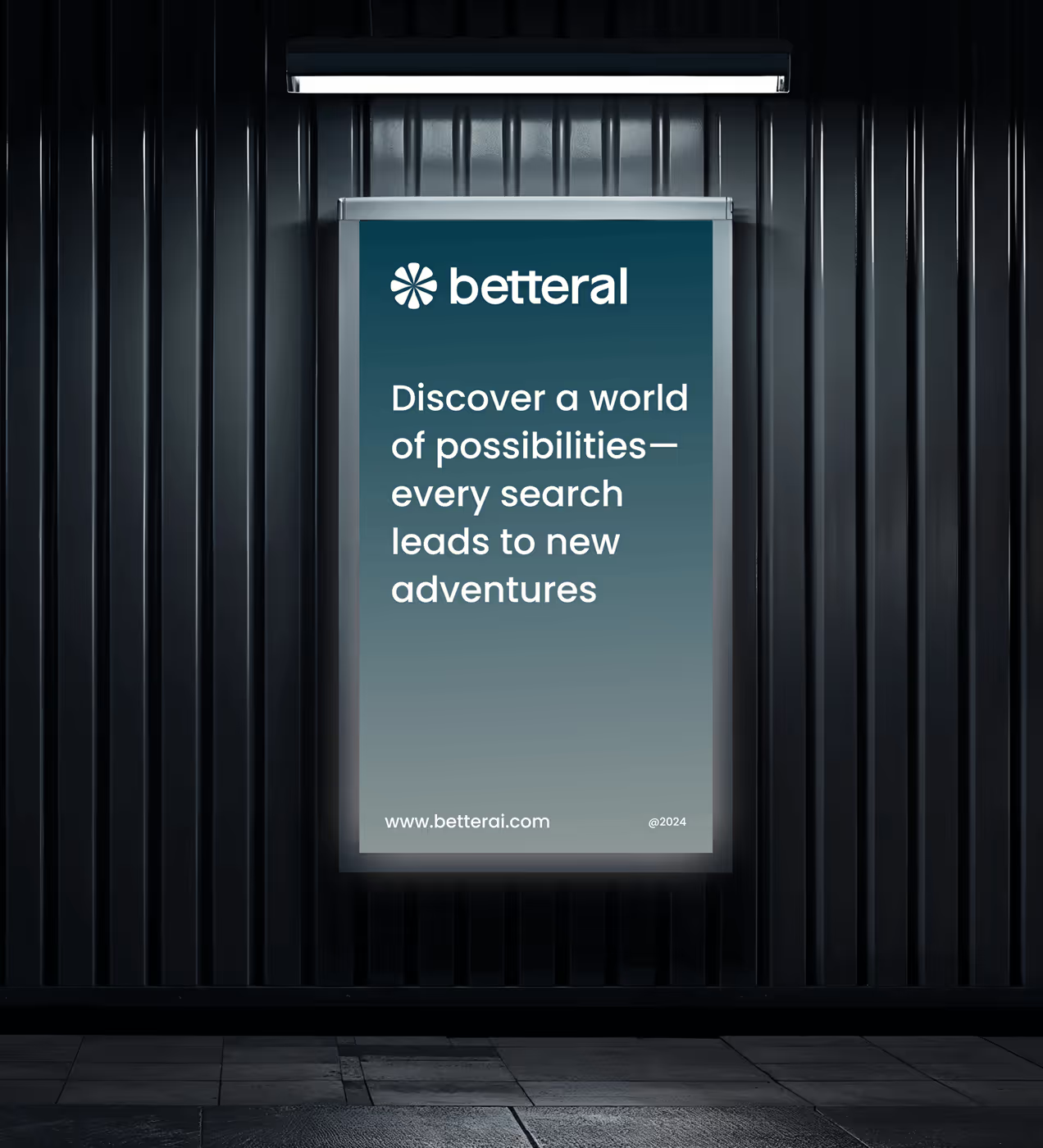
Visual identity and brand story
BetterAI is designed as a calm, intelligent companion for everyday tasks. The visual identity reflects clarity, trust, and balance across all interactions.
A soft blue grey palette and friendly typography create a sense of reliability, while consistent icons and layouts guide users effortlessly.
The brand feels confident yet human, positioning BetterAI as an AI that users can rely on every day.


A clear and consistent UX foundation
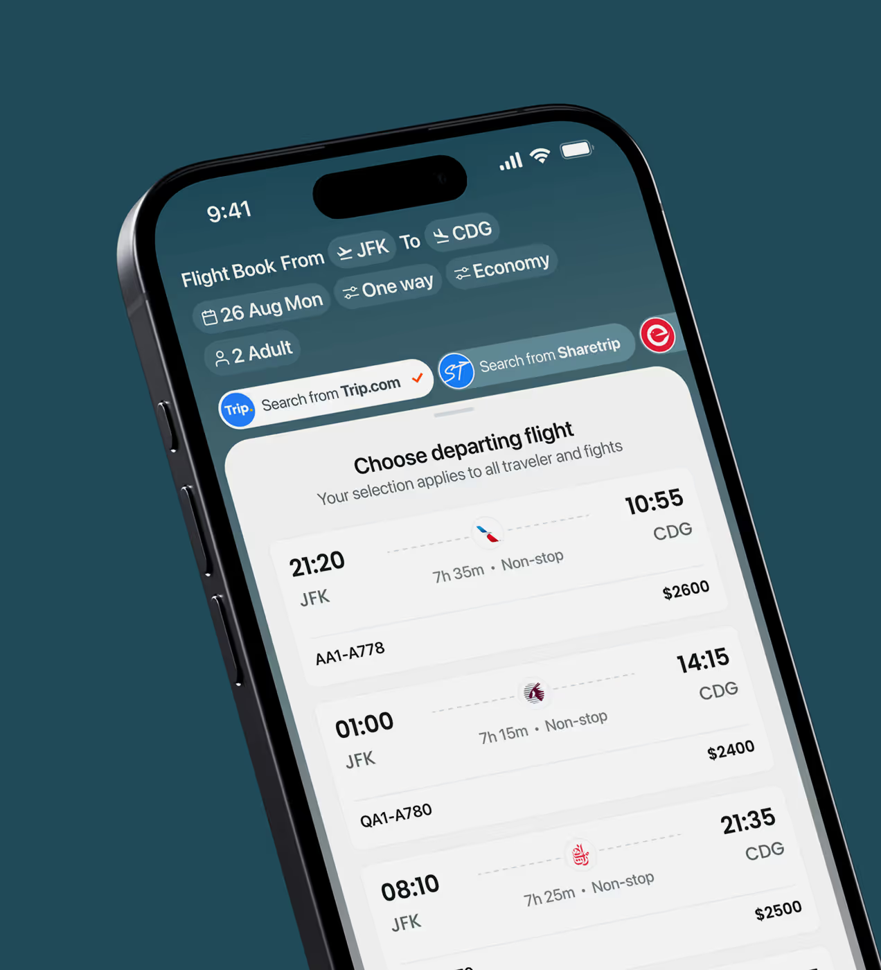
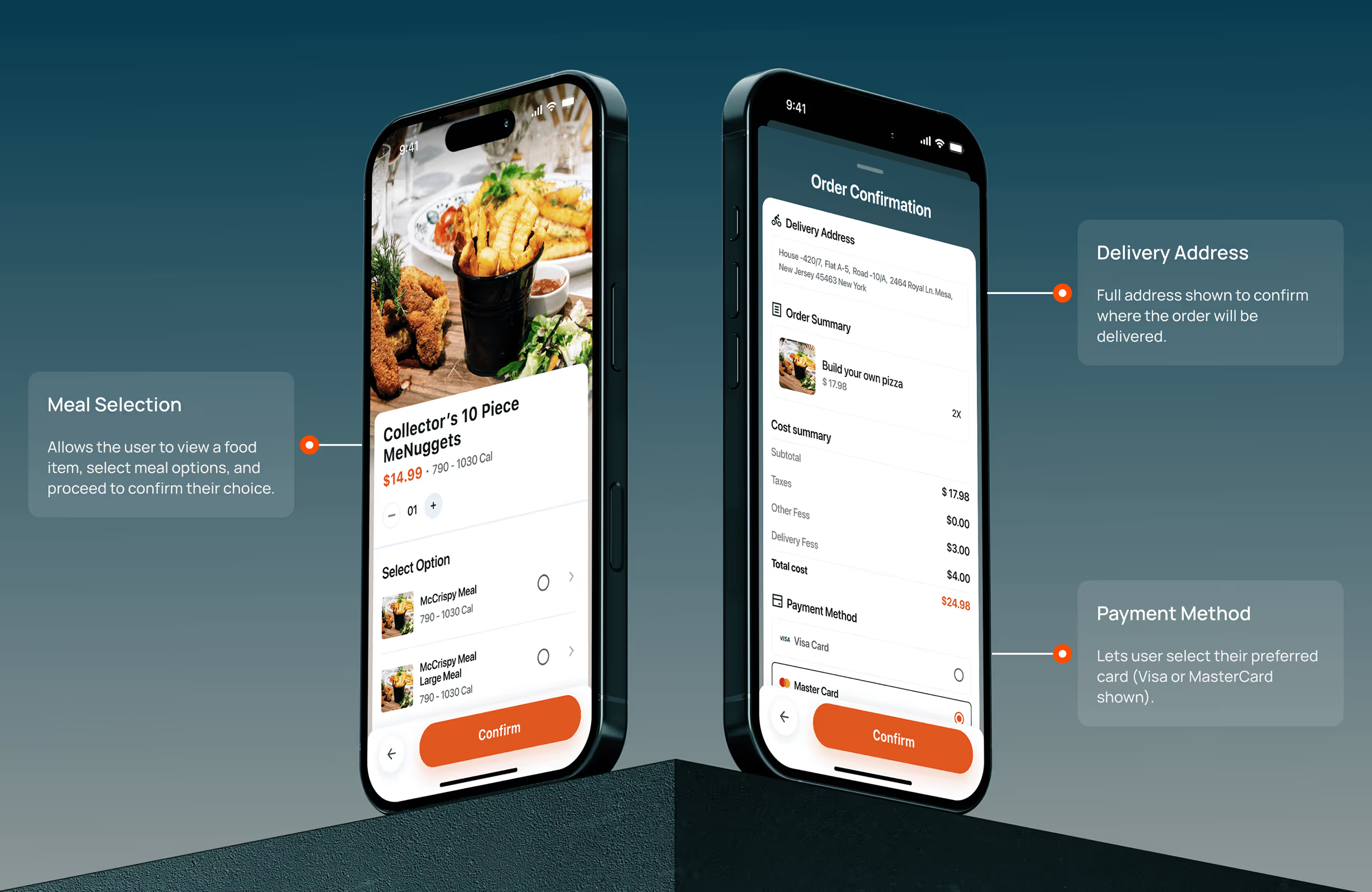
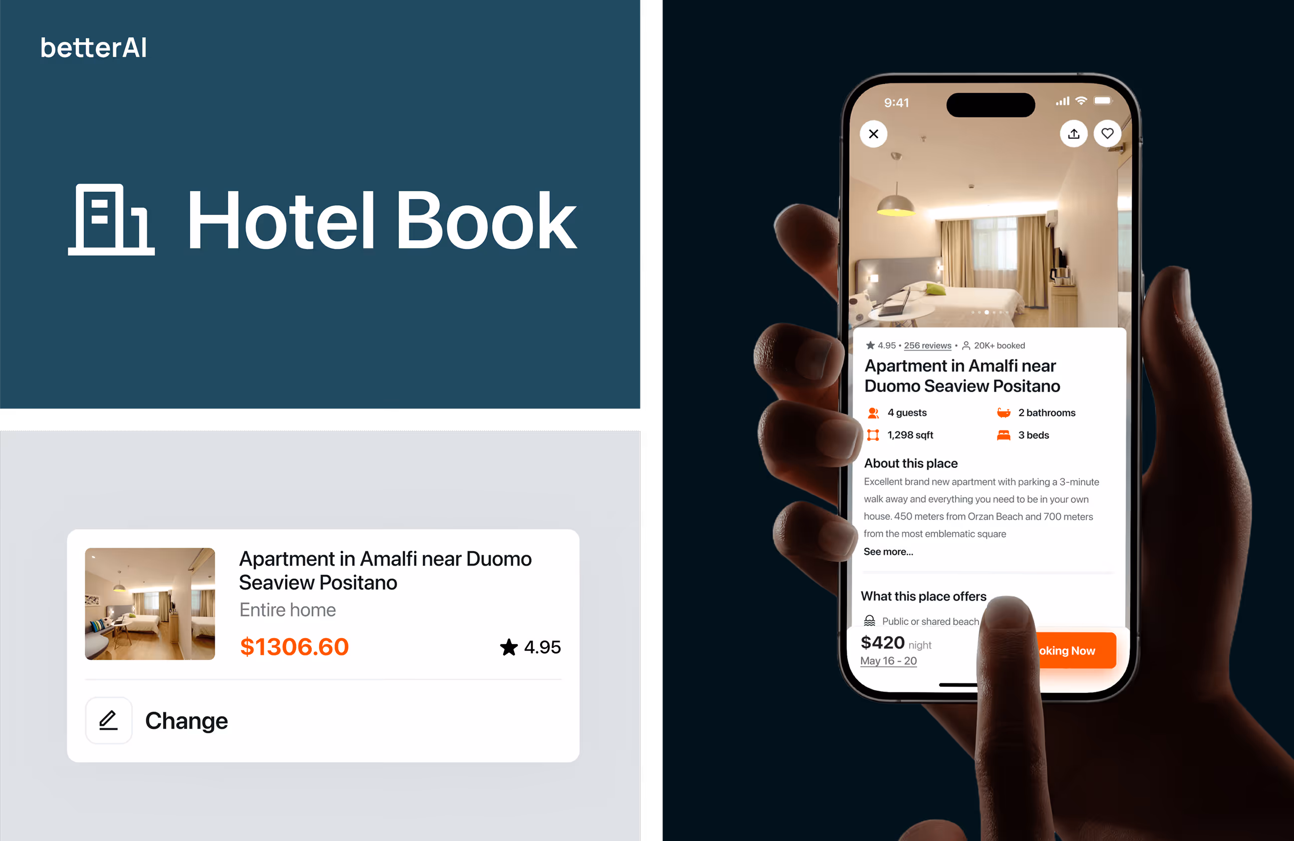
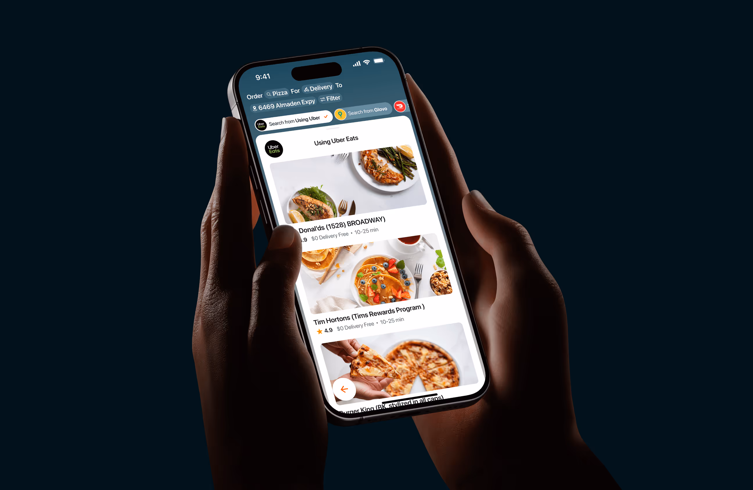
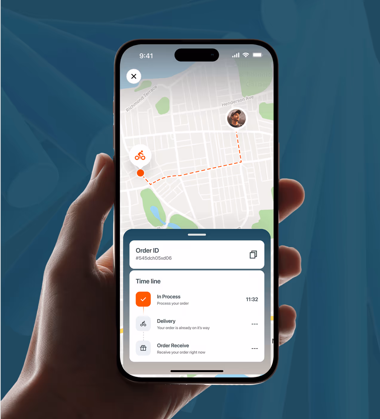
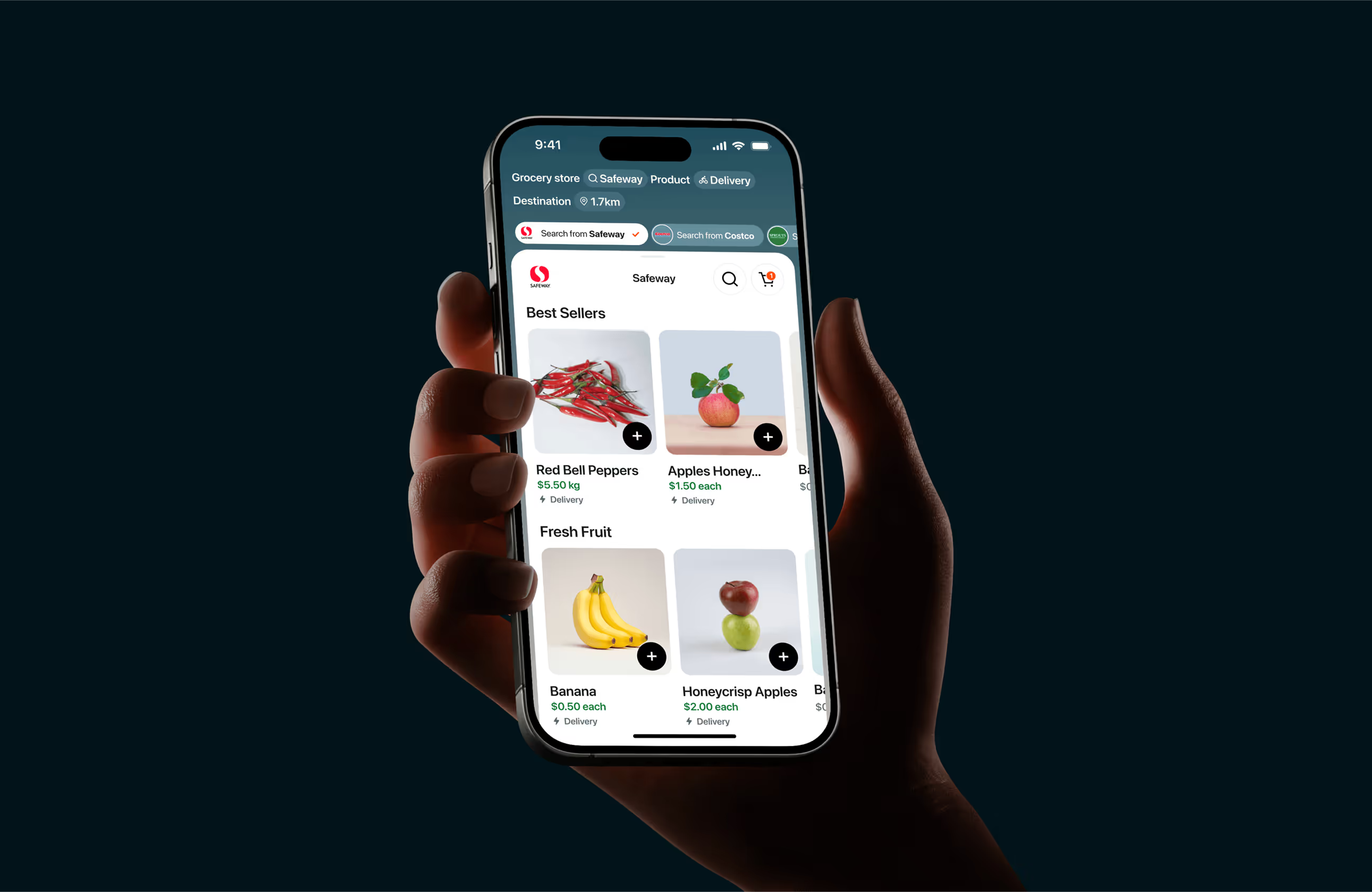
BetterAI was designed to help users complete everyday tasks with less effort across food, flights, hotels, and doctors. We built a grid-based, component-driven system for clarity, speed, and scalability on both small and large screens.
The palette uses Arapawa, Tangelo, Black Pearl, and Gainsboro to keep the experience calm, confident, and easy to scan. Manrope was chosen for its friendly feel and strong readability. Icons and buttons follow consistent rules so key actions are recognized instantly.
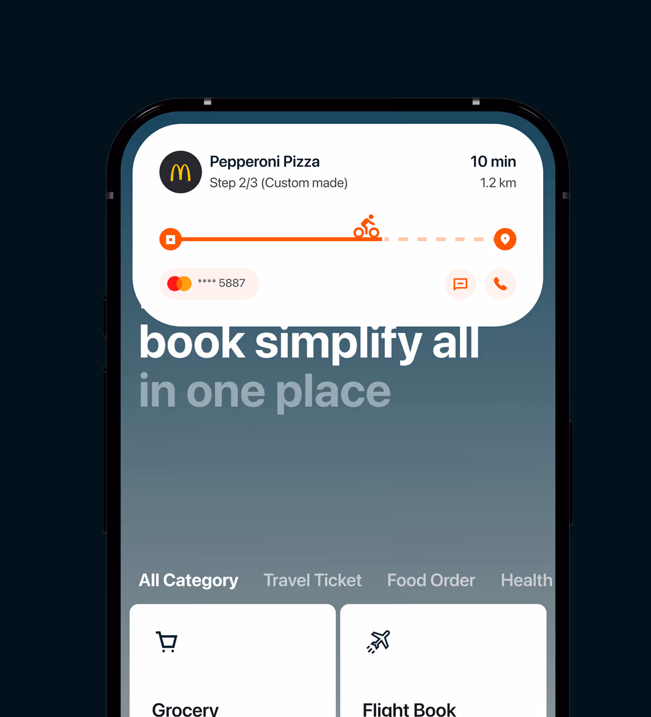
The UX supports voice commands, live tracking updates, and smart plugins to reduce app switching and keep users in flow. Clean layouts reduce visual noise, make scrolling easier, and highlight primary actions so users can decide faster.

A simpler experience that supports everyday decisions.
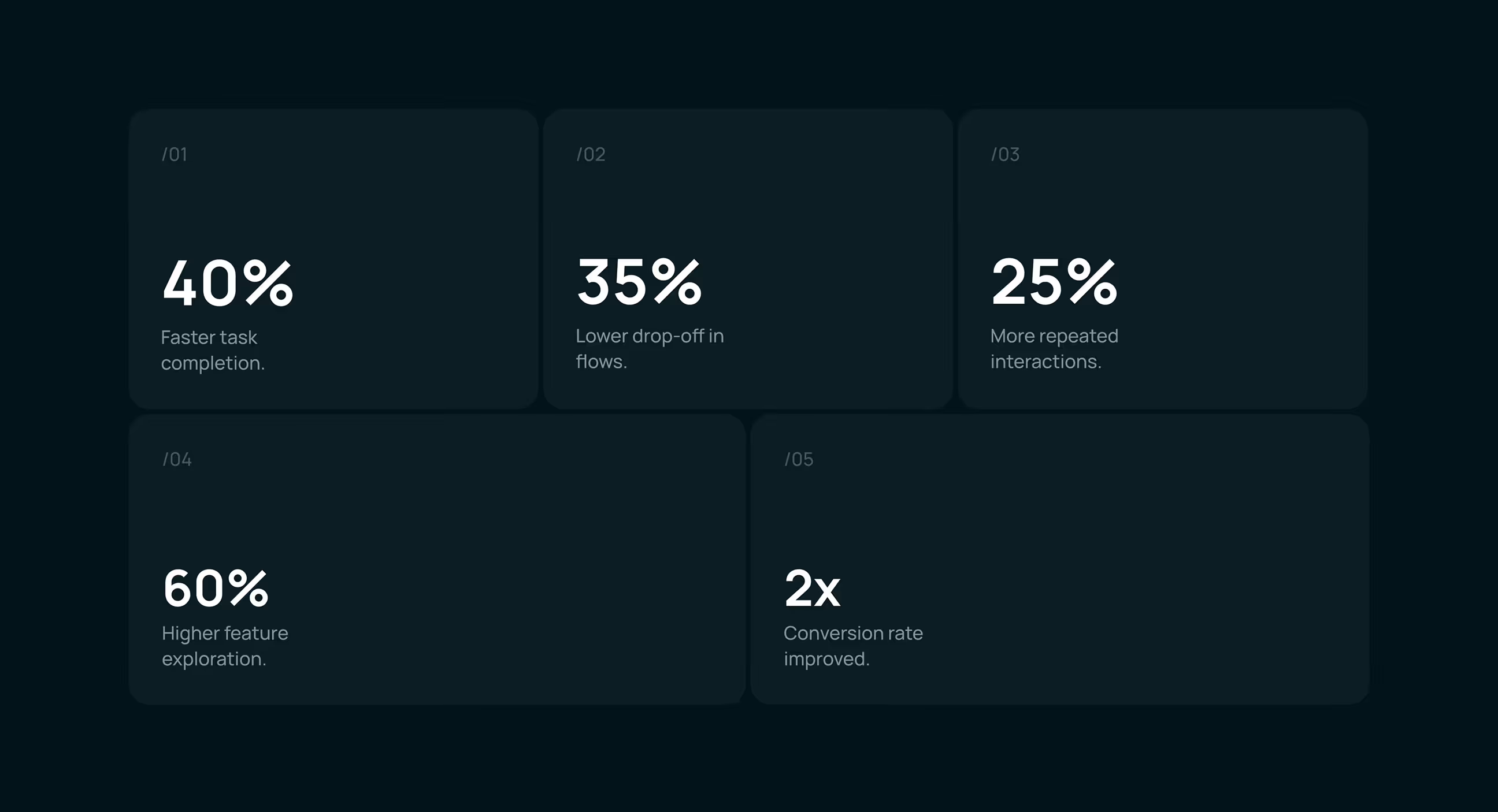
The redesigned BetterAI experience led to clearer usage patterns and stronger engagement. By reducing friction and guiding users through tasks more confidently, users interacted more deeply with the product and returned more often.
- Faster task completion: Simplified flows and clearer hierarchy helped users complete everyday actions more quickly.
- Reduced drop-offs: Guided task flows and fewer distractions lowered abandonment during key actions.
- Improved retention: Users were more likely to return after their first session due to better onboarding and clarity.
- Stronger conversions: Clear CTAs and focused journeys improved completion of core actions across the app.
- Higher Conversions: Conversion rate doubled, improving core business performance.

An all-in-one AI app built for everyday life. An all-in-one AI app
.avif)
.avif)
Have a Project? Let’s talk!


.png)
.png)
.png)
.png)

.png)


