Design for a fast & friendly Fintech experience

About Quicky
Quickly was created as a fintech SaaS app where users can handle their financial tasks, such as sending payments, dividing bills, and tracking their costs. It’s made for people who want fast, clear control over their daily finances without getting lost in complex tools.
Quicky offered us a strong concept and looked to us for turning it into an easy-to-use feature. Their goal was to create a design that was clear, modern, and felt straightforward on the first try. Our job was to create an app for them that met their vision and could adapt to more users.
.png)
The Problem
Quicky had a great product idea, but the early design lacked direction. I found the interface hard to use, and the speed and security I need from a financial app weren’t there. The design was basic, and it couldn’t perform real-world jobs.
These design gaps were holding the business back:
- No clear brand identity to build user trust
- Complex user flows that slowed down actions
- Inconsistent interface patterns across the app
- Overwhelming layout, especially for first-time users
- Lack of visual hierarchy made navigation harder
Consequently, users did not feel comfortable taking charge of their money. Because of this, the company struggled with user interest, had fewer people remembering the app, and faced challenges in presenting their idea to partners and investors.
The Solution
We designed a solution for Quicky by focusing on users’ needs and creating a strong visual identity. Every interaction was rebuilt to feel fast, friendly, and intuitive. We aimed to make activities financially practical, speaking, and help define the brand as an online identity.
Here’s what we delivered:
- Introduced a bold yet minimal interface to boost trust
- Designed frictionless flows for account linking and transactions
- Added smart UI feedback for faster, clearer user actions
- Applied a modern grid and hierarchy system for clean layouts
- Connected brand visuals with real-world banking actions
As a result, users get to try a fintech experience that is both useful and empowering right away. It helps people feel confident, motivates them to act, and is easy to use every day.


Design Process
Our Quicky design process follows a Lean UX methodology that is comprised of 7 steps, broken down into 4 phases. The methodology provides business-oriented steps supported by the principles of transparency and the requirements for speed and scalability.
.png)
UX Research & Design Artifacts
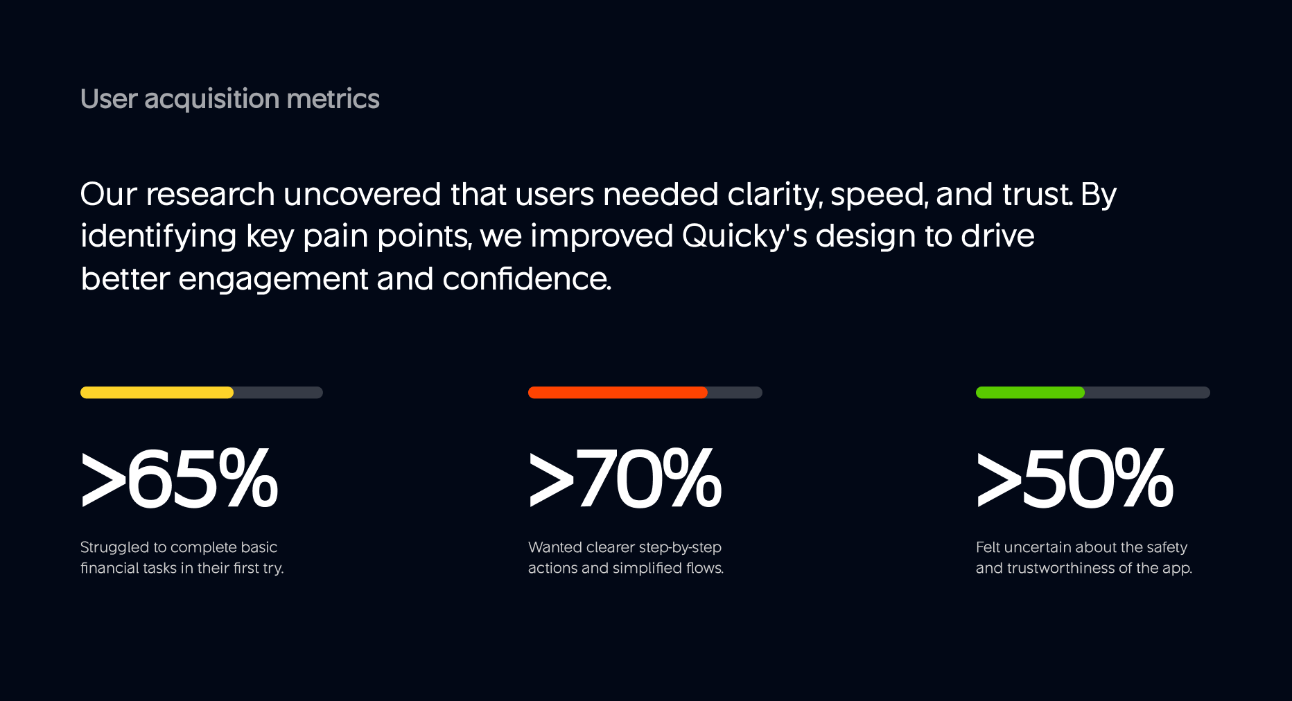
Our team looked into how Quicky users act and the moments when many users leave the platform. Because of their feedback, we enhanced the main screens, made the app clearer, and made it more stable.
Main findings and ideas for the design:
- 69% of users reported the previous method of using the site to be confusing and lacking guidance. We rearranged the menus and included visual highlights to make the site operate smoothly.
- 54% missed real-time feedback when sending or receiving money. We introduced markers of progress and affirmations of success for users
- 47% said the interface looked too plain and didn’t feel like a finance brand. We brought in an innovative UI, showcased vivid brand graphics, and highlighted helpful signals.


Visual Identity and Brand Story
Quicky has a design that looks fast, fresh, and simple to rely on. The logo looks fluid, much like money being used. We used clean black and white to keep it simple and professional, while the colorful lines on the cards add energy and fun.
The text style is bold but easy to read, making every word feel clear. The appearance of the smartphone app and real bank cards is unified and intelligent. The whole brand makes users feel like they’re using something strong, safe, and built for their everyday life, without any confusion


Design System
Ensuring everything works the same, we put in place a complete design system for Quicky. It includes essential colors, special fonts, and usable sections such as buttons and cards. The choice of colour uses strong and dark tones together with light and soft ones to maintain balance.
For better reading on a variety of screens, we applied GT America and SF Pro to each label. With this system, designers and developers can work efficiently, consistently, and not having to guess. Using this method, it’s simpler to evolve and improve the product without starting from the beginning again.


UX Design
We designed Quicky to be simple, fast, and helpful, especially for daily money tasks. You can see both your current account balance and the last few transactions right when you open the app. It only takes a few simple actions to send or request money, with the main buttons and a quick swipe.
People can reach banks conveniently using a user-friendly, searchable list. Rewards, cards, and account settings can all be found by tapping on the bottom bar. No matter if you’re checking accounts, looking for local specials, or watching videos, the app is always easy and modern to use.


Results & Outcomes
The redesign helped Quicky become easier to use, more modern, and more reliable. The users had more confidence in their ability to make and request money transfers. Using the app now feels easy, quick, and secure, just as people hoped for with a finance app.
Key outcomes from our redesign work:
- 82% of users felt more confident using Quicky after the redesign
- 68% found it easier to send, request, and track money
- 91% said the app now looks clearer, more modern, and trustworthy

impactful solutions!


"Wavespace turned our vision into a smooth, modern app our users love. Their design made Quicky clearer, faster, and easier to use. Huge impact on user trust and engagement."