

Kodezi: AI code generator for SaaS software to help developers


About Kodezi
Kodezi is a fast-growing SaaS software company based in San Francisco, focused on helping developers code faster and cleaner using AI. With a team of 11–50, they’re building what they call “Grammarly for programmers.”
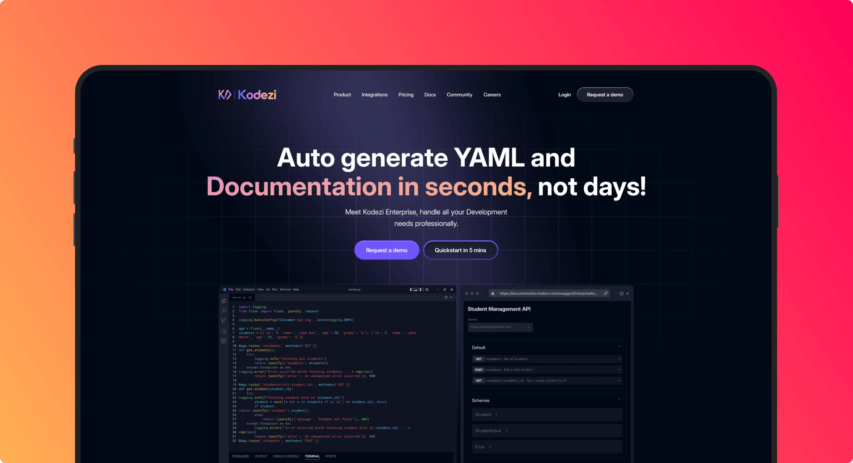
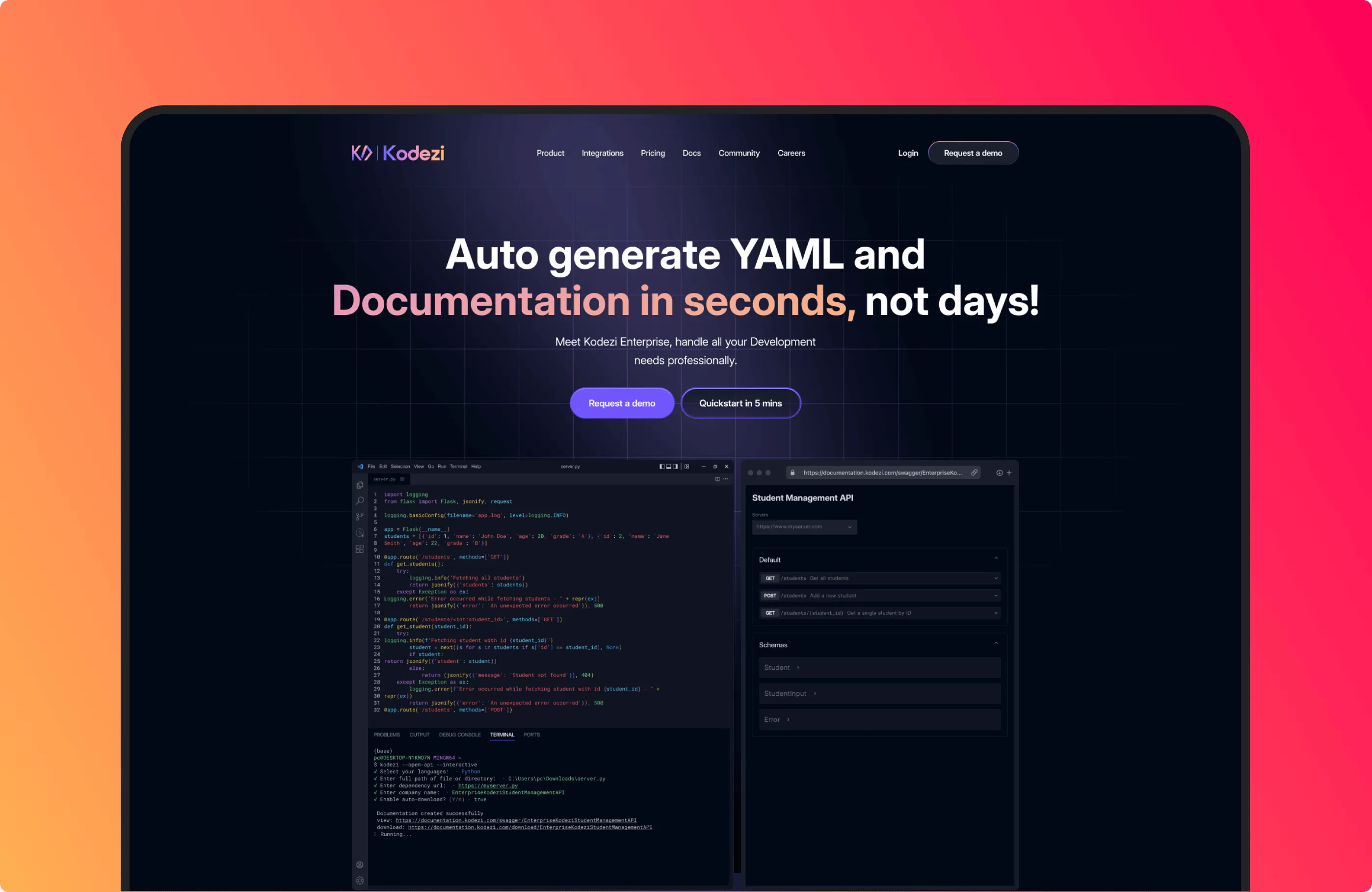
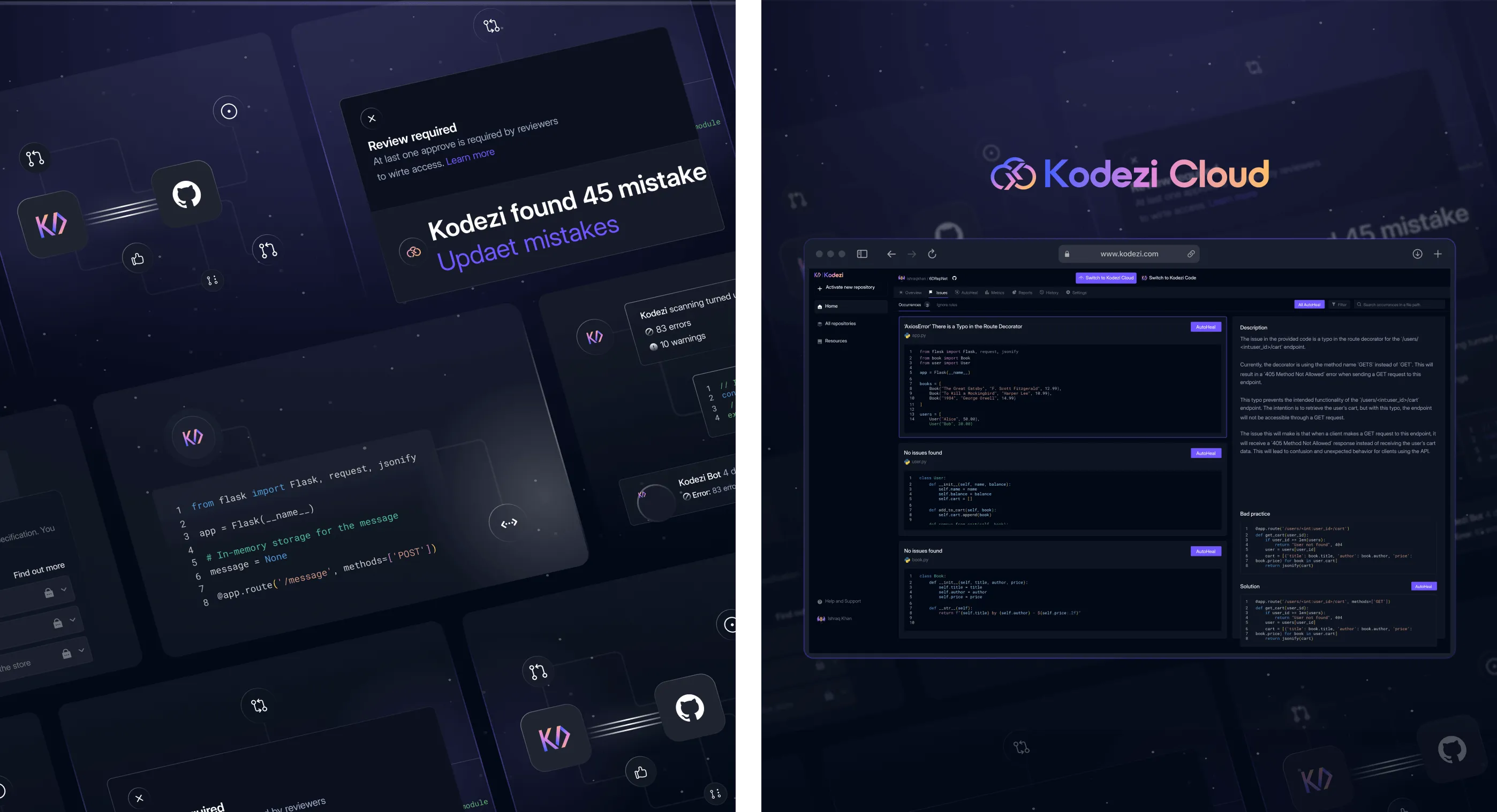
Their tool improves code, fixes bugs, and generates documentation across platforms like VS Code and browser IDEs. Kodezi reached out to us needing a complete redesign, website, mobile, and brand identity. Their goal was to create a digital experience that matched the power of their product while earning trust from technical teams and business buyers.
The Problem
Kodezi had powerful tech, but users didn’t understand it. The homepage was unclear, the design felt incomplete, and people left before discovering its value. Even developers were unsure how to use it. Without clear onboarding or structure, both users and teams struggled to navigate, slowing growth and adoption.
- Users dropped off due to the unclear homepage
- Core features were hidden or hard to find
- Teams lacked a design system for updates
- Confusion slowed product demos and adoption
The Solution
A simple style change wouldn’t be enough for Codegee; we had to change the way users interact and engage with the platform. We wanted to build user trust, increase discovery, and provide an intuitive path from the first interaction with the service to everyday use. We tried to balance style and usability, ensuring that it was clear in style and that the platform’s goals were effectively communicated to users.
- Rebuilt the homepage to clearly explain Kodezi’s value in seconds
- Designed a bold visual theme that matched the developer's energy and speed
- Highlighted key features like documentation and autofix with better visibility
- Created a smooth onboarding experience with clear CTAs and helpful steps
- Unified all platforms (CLI, Web, Mobile) under one consistent design language
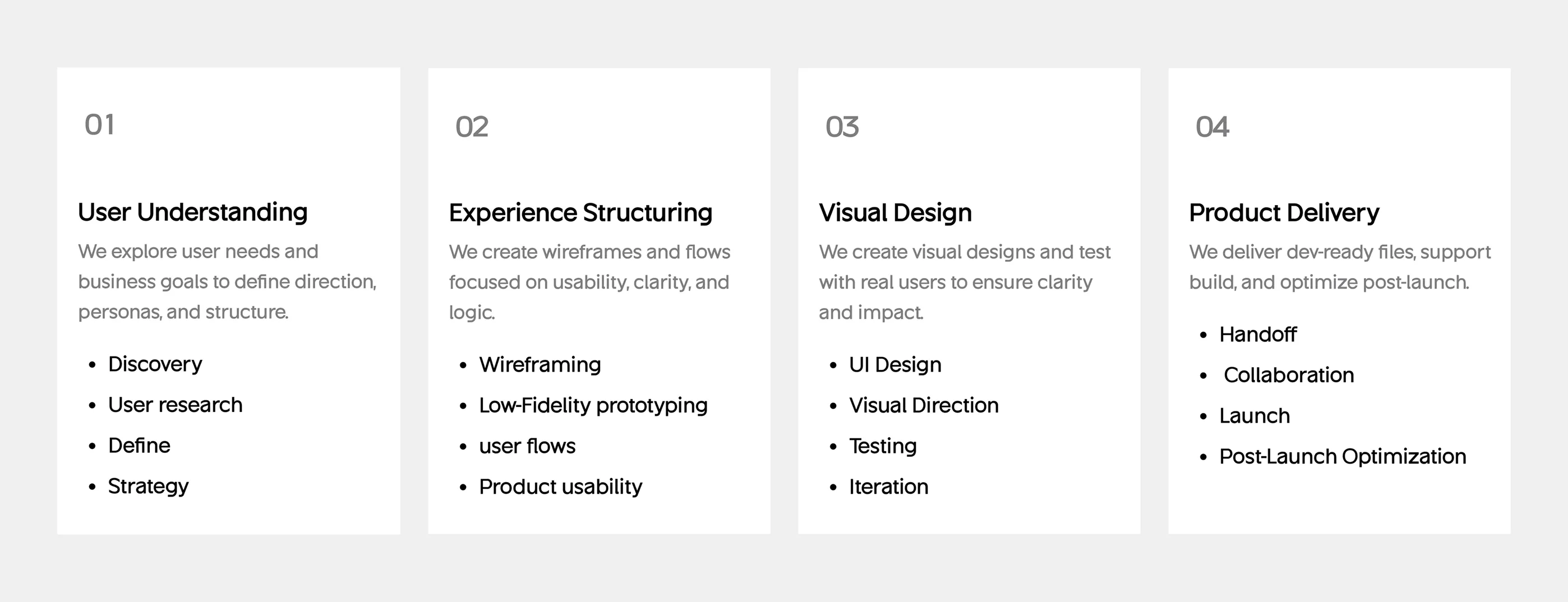
Design Process
Our Kodezi design process follows a Lean UX methodology that is comprised of 7 steps, broken down into 4 phases. The methodology provides business-oriented steps supported by the principles of transparency and the requirements for speed and scalability.
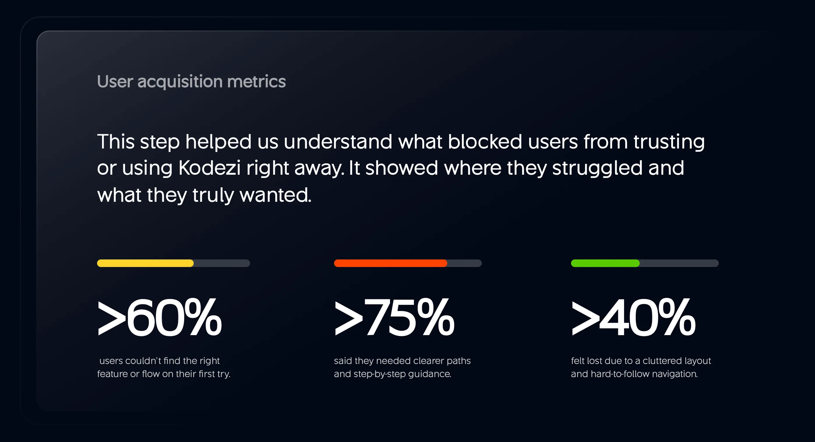
UX Research & Design Artifacts
Our research phase was long, emotionally charged, and involved extensive examination of real-world data. We engaged users, understood their key concerns, and mapped their experiences as they moved from uncertainty to assurance. With each new insight, our approach changed and helped remove barriers.
User Acquisition Results: Our research found that over 60% of users had trouble finding the information they needed immediately, highlighting the need to improve the clarity of the main interface.
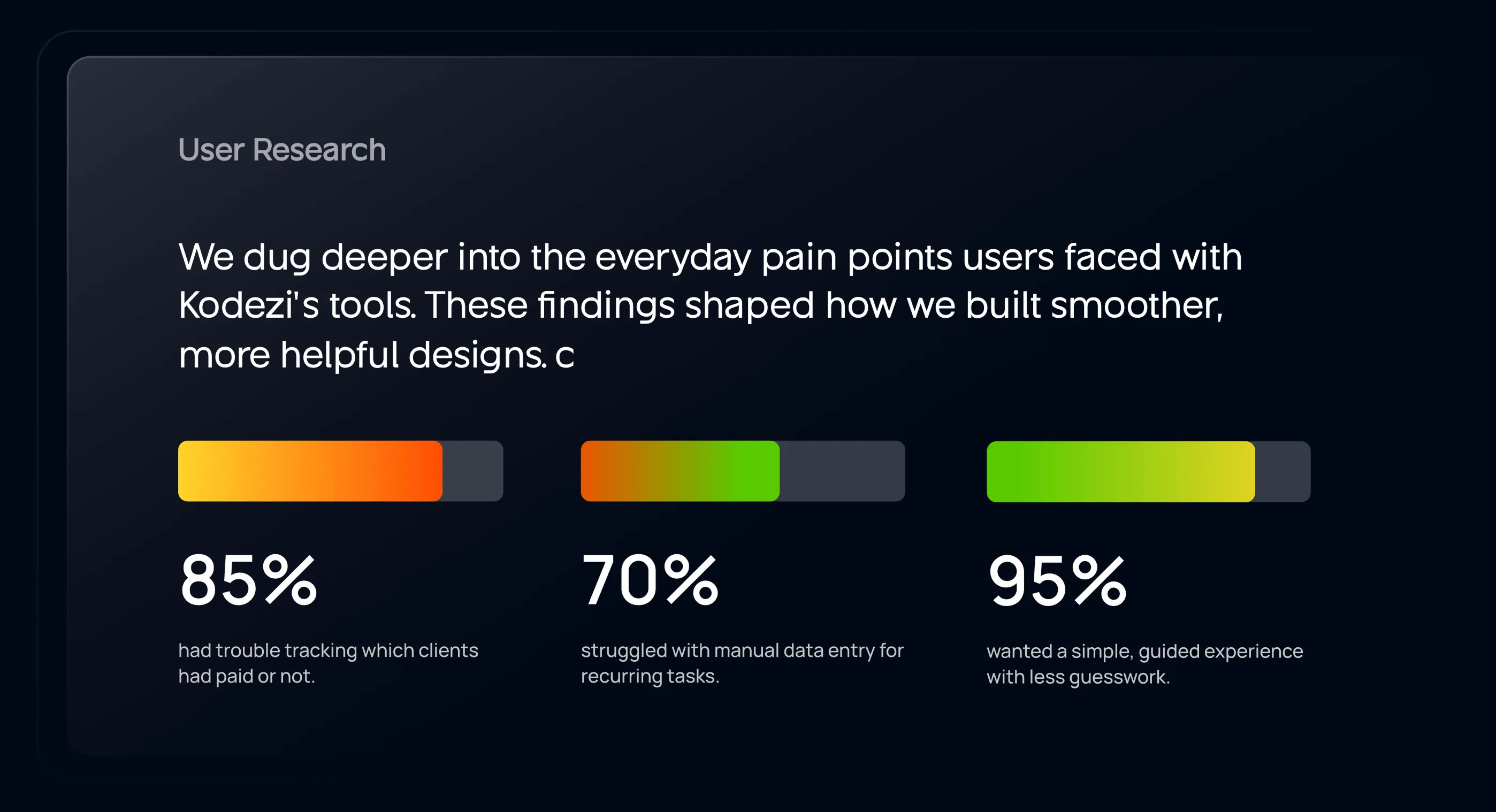
Personalized Onboarding Need: 75% of users asked for step by step instructions, so our team tried to create an easy, personalized onboarding path.
Desire for Simplicity: 95% of people preferred a simple design with helpful instructions. As a result, we focused on action-oriented screens, eliminating clutter.
Visual Identity and Brand Story
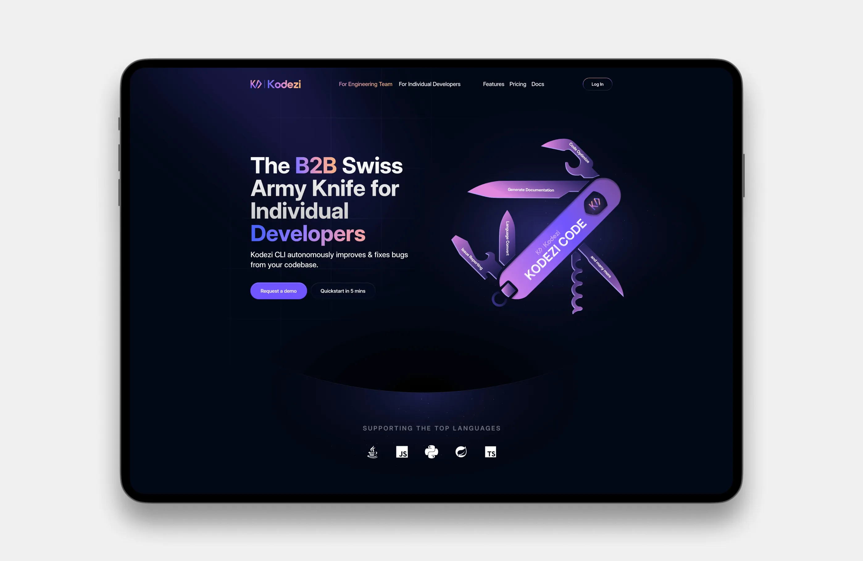
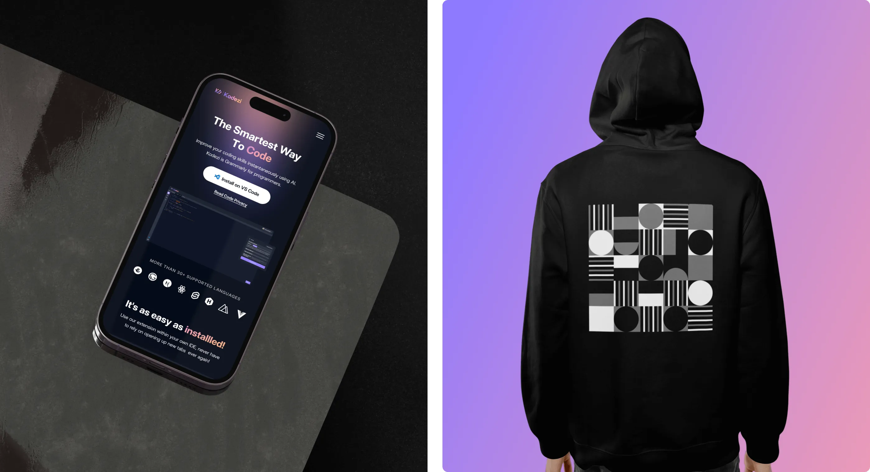
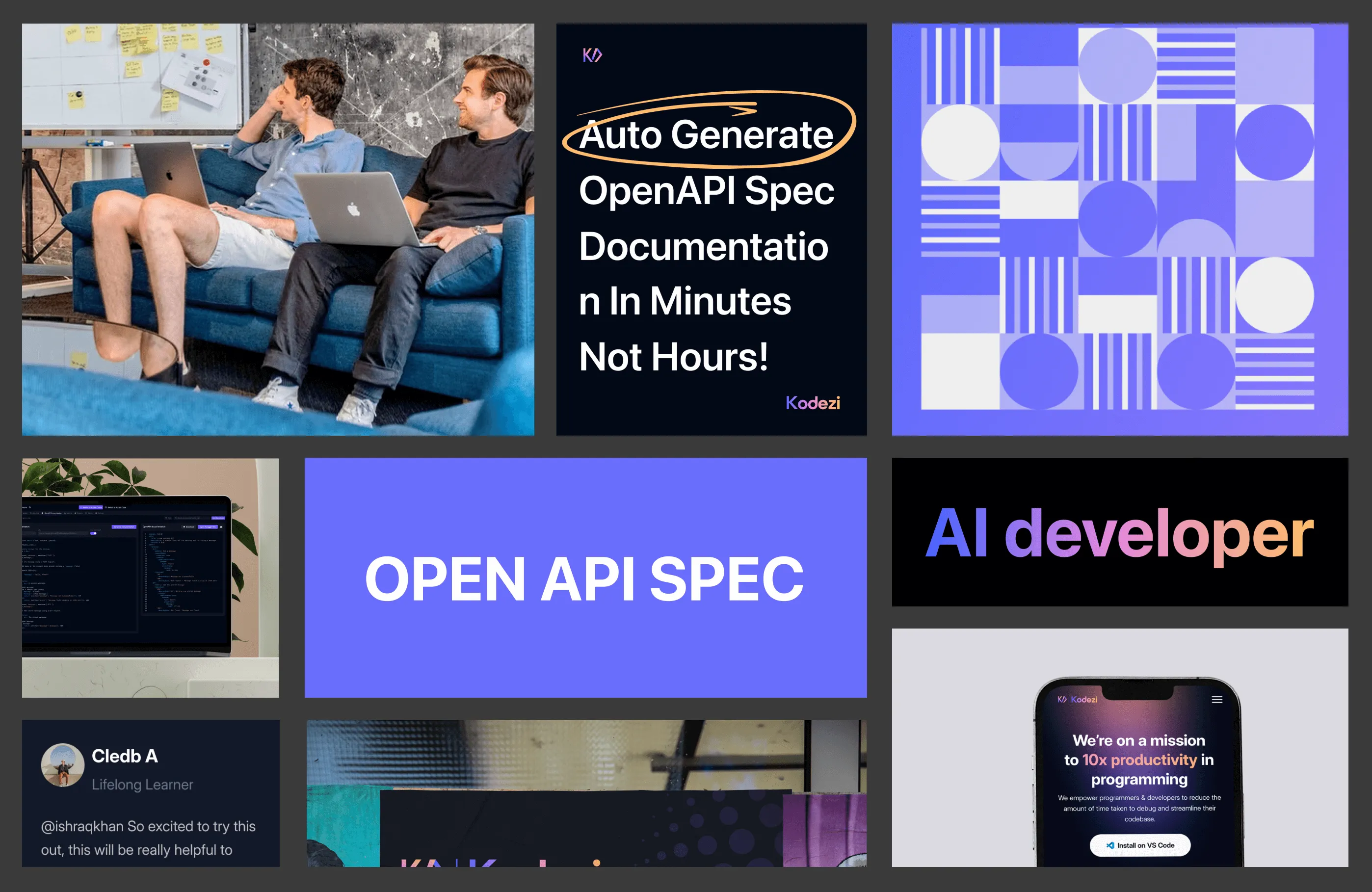
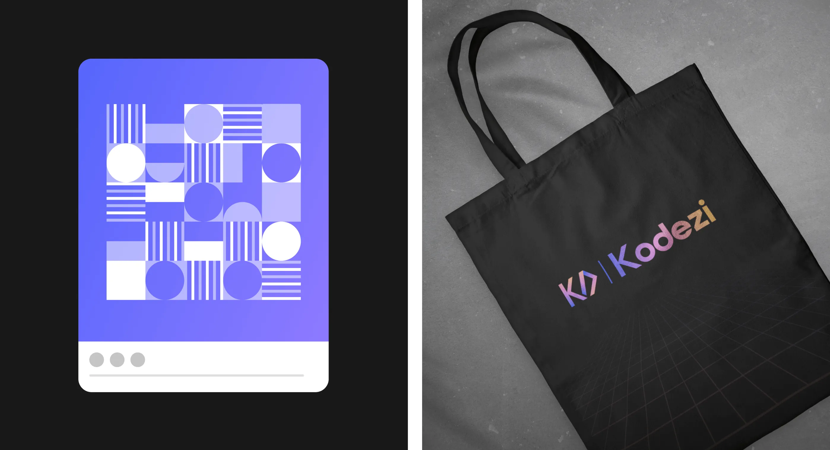
Kodezi wanted a brand identity that is fast, elegant, and developer-oriented. Our design had a deep background with a lot of gradients that highlighted energy and forward-thinking innovation. The purple-to-pink palette gave it a modern edge, while custom geometric patterns brought a sense of structure and logic. Our typography and iconography designs are crafted with the needs and styles of solo developers and B2B businesses in mind.
The Swiss-army-knife graphic became a visual anchor, showing how versatile the tool is. By adding branded hoodies, bags, and layouts, we brought this identity online and offline, inspiring users to join and trust it, and establishing the platform as a future-ready brand.
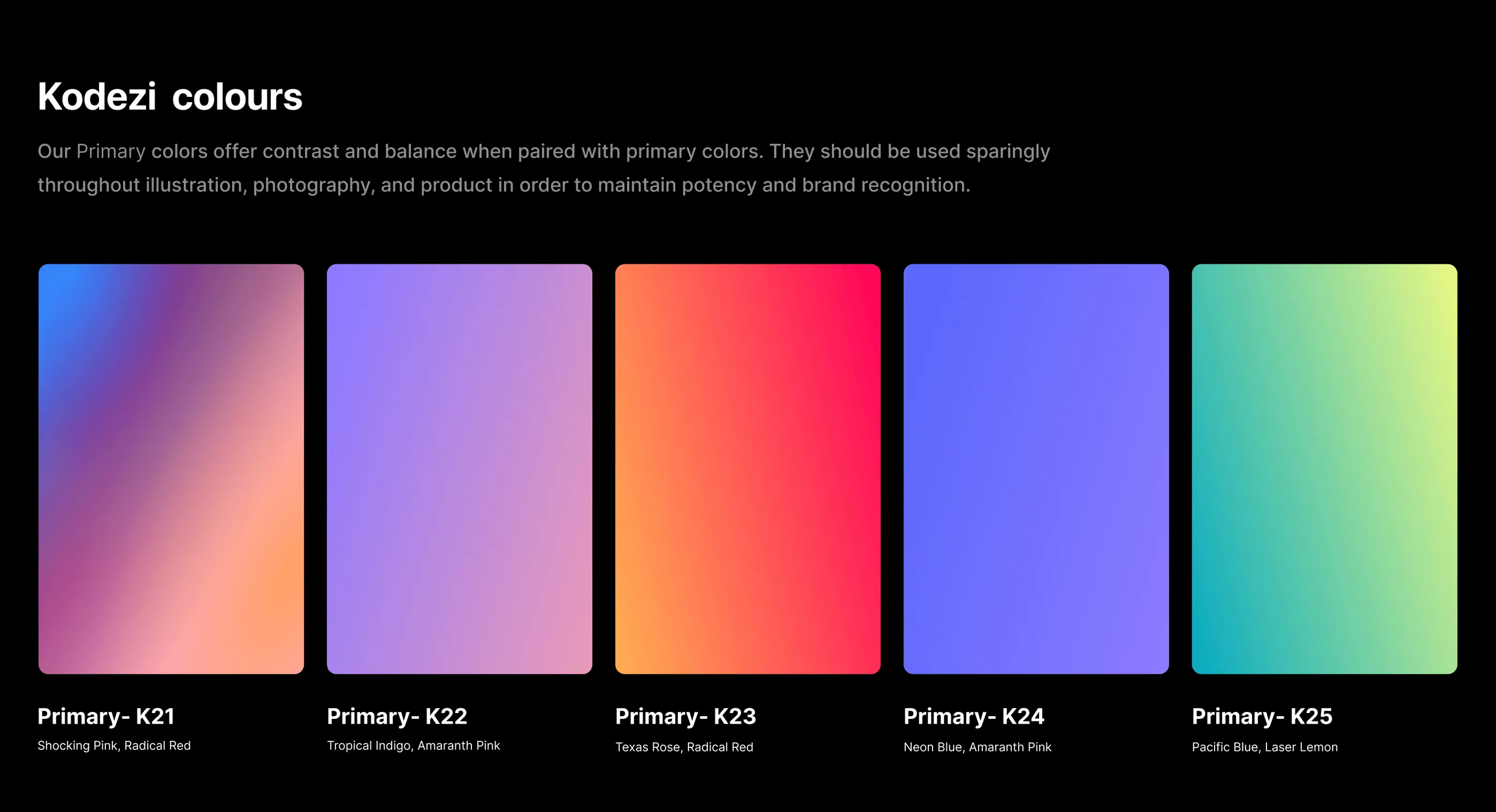
Design System
Kodezi’s design system was built for clarity, speed, and scale. We crafted a strong visual foundation using modular components that adapt across platforms, desktop, mobile, and web IDE. To draw attention to the main works, we placed bright gradients (K21–K25) against deep blacks and added intentional contrast.
We chose Inter Display because its clean style works well and makes the content easy to read on any screen. Each token, color, text style, and spacing was documented for easy developer handoff. This system doesn’t just look good; it helps Kodezi move fast without breaking consistency as their product continues to evolve.

UX Design
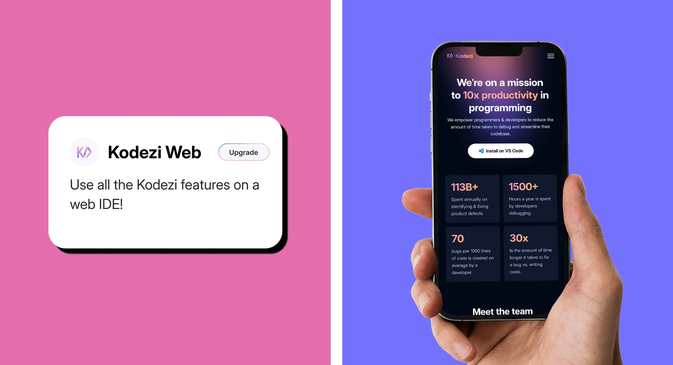
We aimed to keep things simple from the start with Kodezi’s UX. We designed flows that guided users from the first click to full adoption without second-guessing. We built experiences that made onboarding fast, focused on what mattered, and freed you from any hassle.
On mobile, we put together clear steps so users feel welcome, see what Kodezi can do, and quickly start to trust our product. On desktop, we gave the homepage a clear narrative: “Here’s what we do. Here’s why it matters.” Every touchpoint reinforced confidence. By simplifying the experience, we let users explore Kodezi’s full potential without feeling overwhelmed.
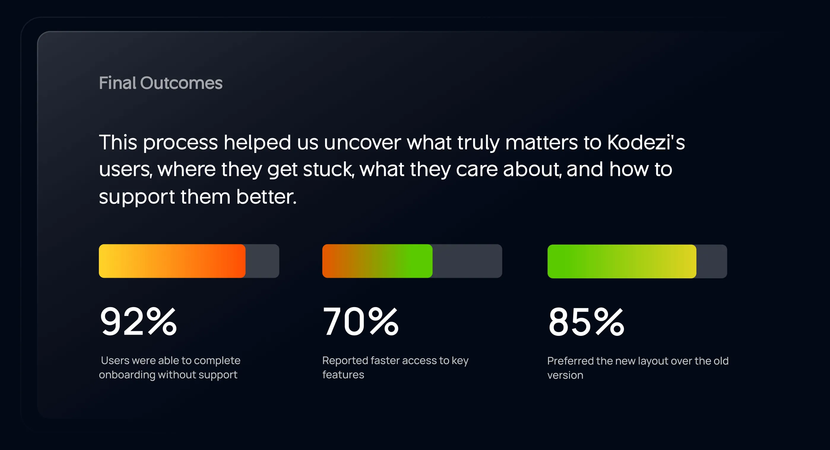
Results & Outcomes
After launch, the platform became easier to navigate, easier to use, and far more engaging. From day one, new users moved through onboarding without needing help. The experience felt natural, guided, and intuitive.
Internally, the Kodezi team gained more confidence in the product, and externally, adoption rates jumped. Once the visuals were improved, selling and pitching the product got much easier for Kodezi. Once people experienced how simple the Kodezi app was, its growth started to speed up.
- 92% of users completed onboarding without external support
- 70% found and used key features faster than before
- 85% preferred the new interface over the previous version
- Demo requests and usage time increased noticeably
.webp)
.webp)
.webp)
.webp)
%20(1).webp)
.webp)
Have a Project? Let’s talk!


"Wavespace very reliable at all times and we have enjoyed working & designs are truly impressive An absolute pleasure to work with and I'm super satisfied wit h the results. Highly recommended!"